Homebrew
Capital. Counsel. Commitment.

Project goals
Refresh and modernize the visual identity and website presence for Homebrew, a San Francisco-based VC firm, including a full redesign and replatform effort.
Our role
UX/UI design, front-end dev, back-end dev on Statamic, illustration, visual identity system and iconography.

Visual identity system
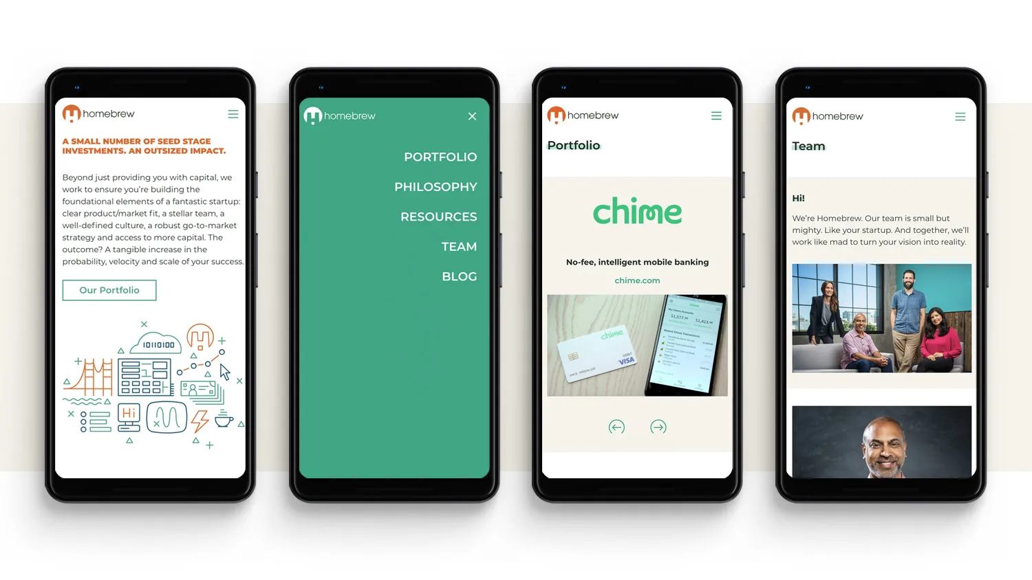
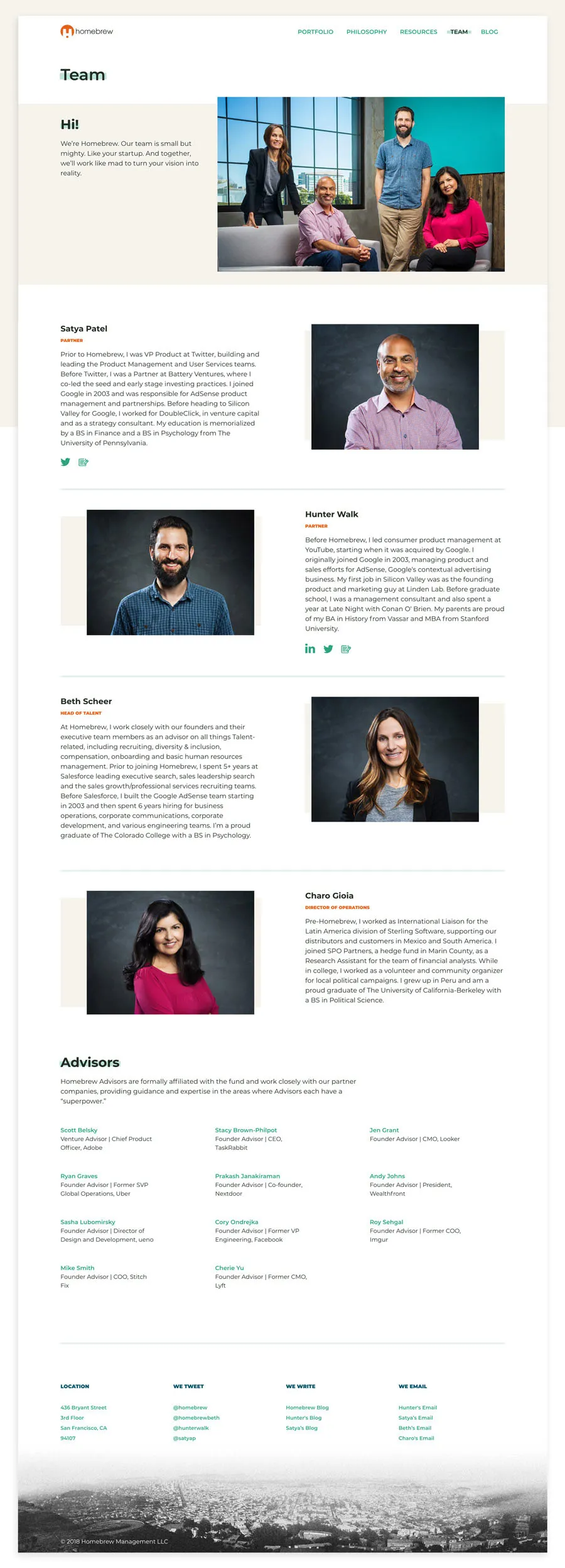
After several years working with Homebrew on incremental updates to their previous site, we welcomed the opportunity to rework their visual identity design system with a focus on simple and clean elements, minimal typography and hits of bright color. We formalized their palette and typographic system, crafted an illustration style and mini library, and wove in some gritty SF landscape imagery for contrast - all while leaving the established logo design untouched.
UX/UI design
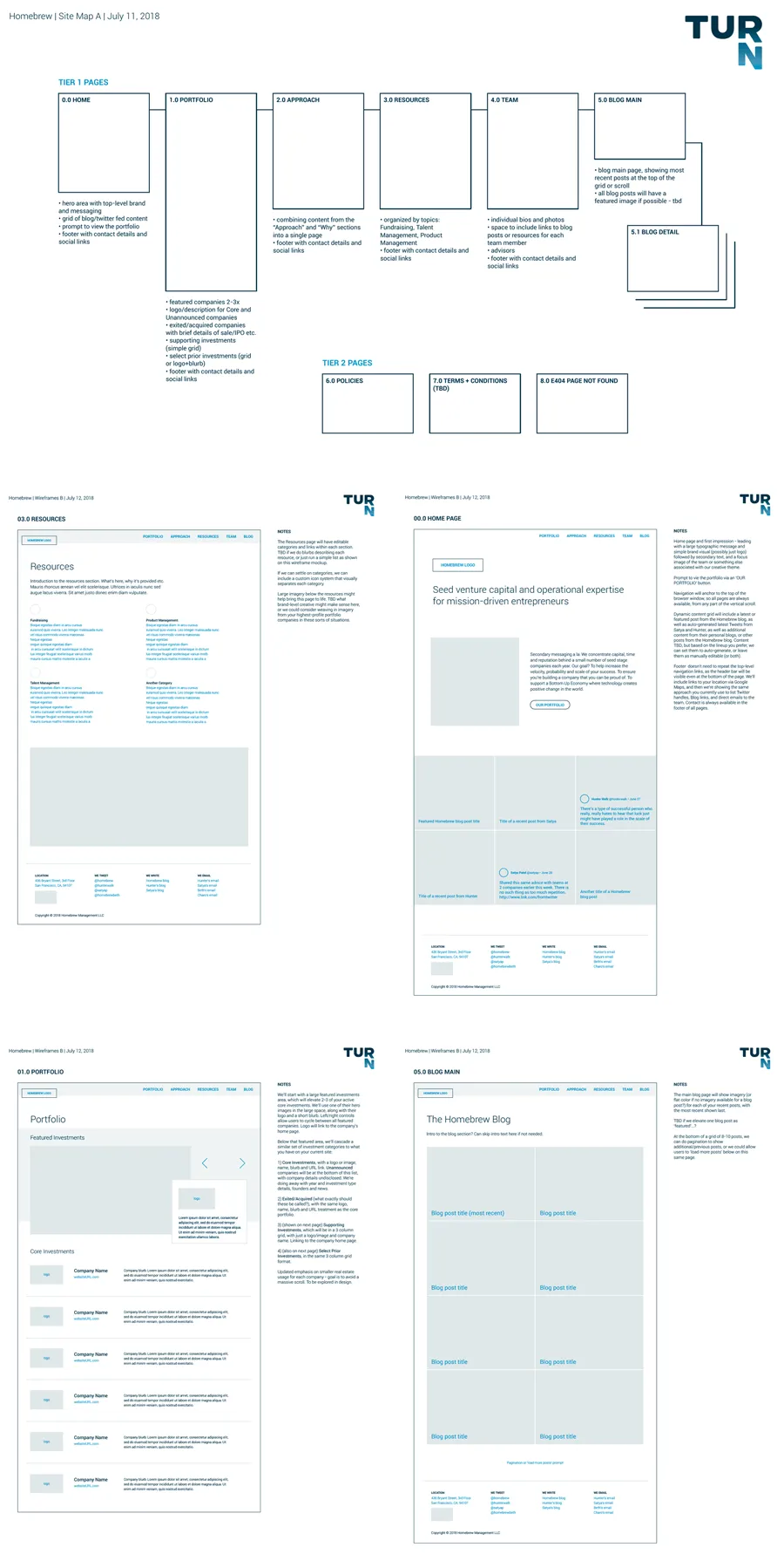
Turn Agency built out high fidelity wires and UX documentation to define our approach to this website refresh. We collaborated with the Homebrew team on updated content and messaging opportunities, which we then wove into our visual design and new navigation approach. With a focus on minimalism, we kept things super clean and extra refined with subtle details.
Replatform to Statamic
We found Statamic to be a perfect CMS fit for Homebrew. We wanted an awesome, intuitive authoring experience, and Statamic’s low overhead puts one foot forward to developing a screaming fast website with great performance whether on mobile or desktop.
Building Champions
Helping companies unlock their full potential, one leader at a time
Digital strategy, content strategy, brand development, UX & UI design, infographics, customer journey mapping and persona development.