Trueyou
Discover your true you

Project goals
TrueYou Food created a video cooking series to help bariatric patients make food they love. Our job was to help launch one of our favorite startups of all time by designing and building a multi-layered website with dynamic technical requirements.
Our role
Brand identity design, print collateral, event graphics, technical strategy, UX/UI design, front-end dev, back-end dev, animation and eCommerce.

Brand and creative theme
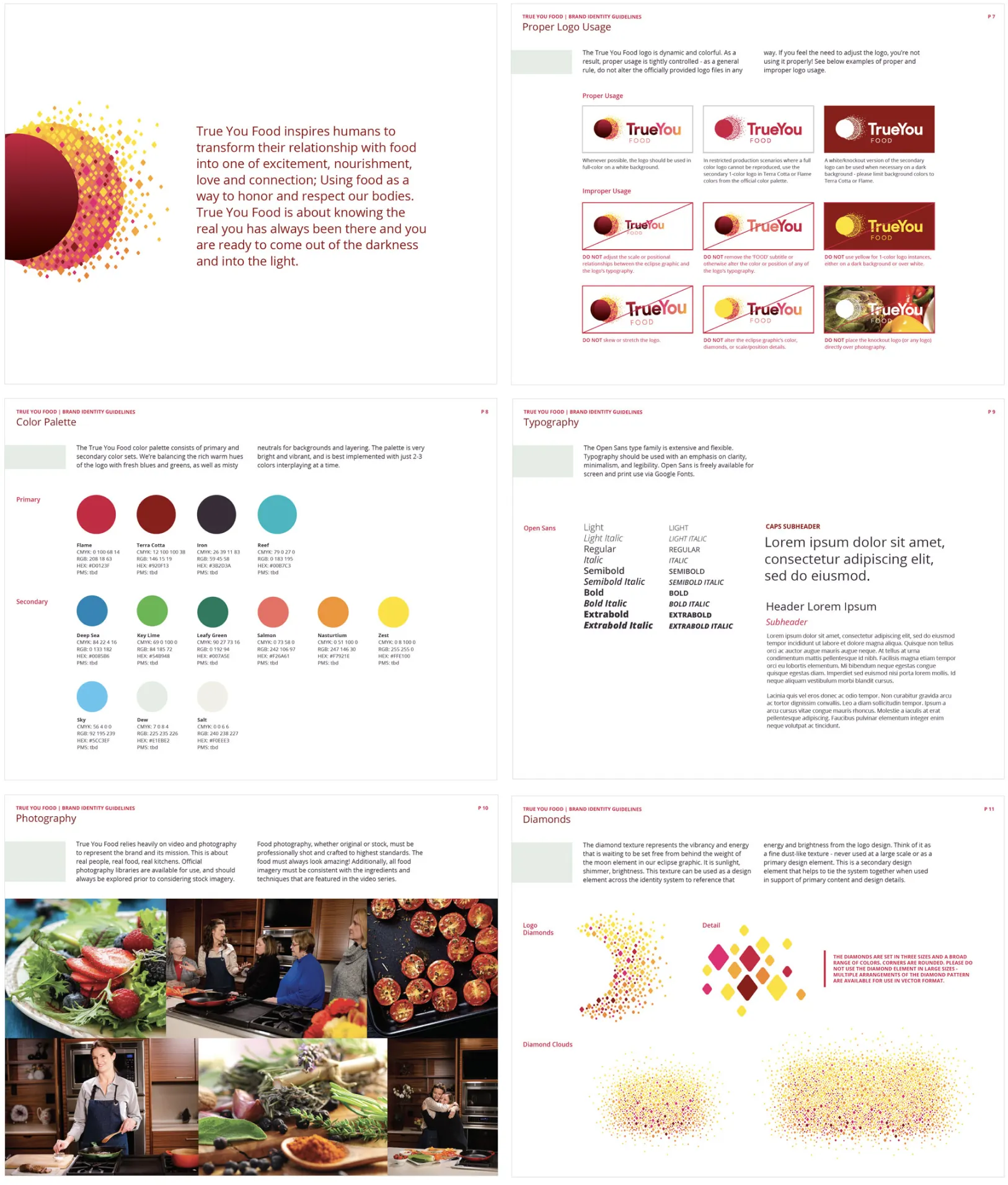
We worked with Rose Archer and the TrueYou Food team from (just about) day 1 on all things brand identity, including crafting the final artwork for their logo, establishing an extensive color palette and selecting a clean typographic system that would serve us across print and digital executions.


Website design
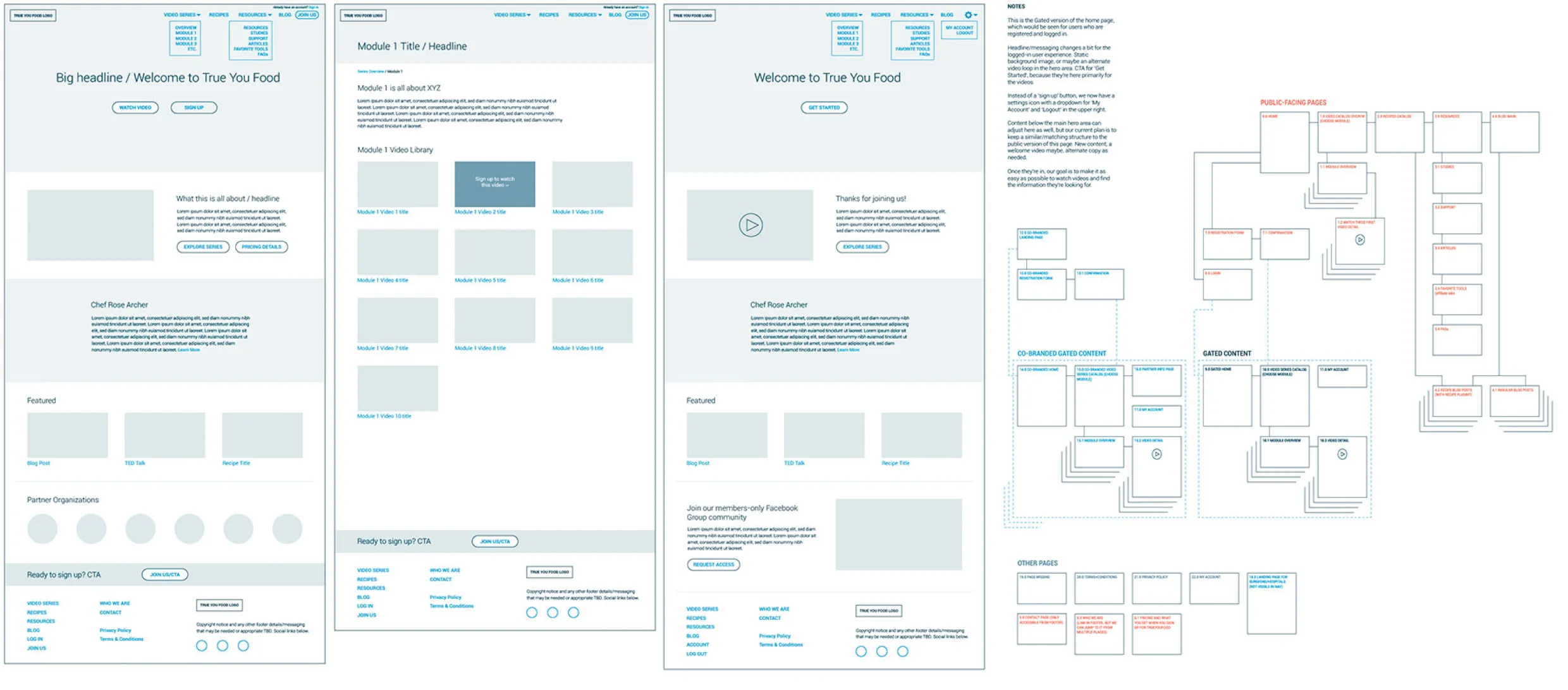
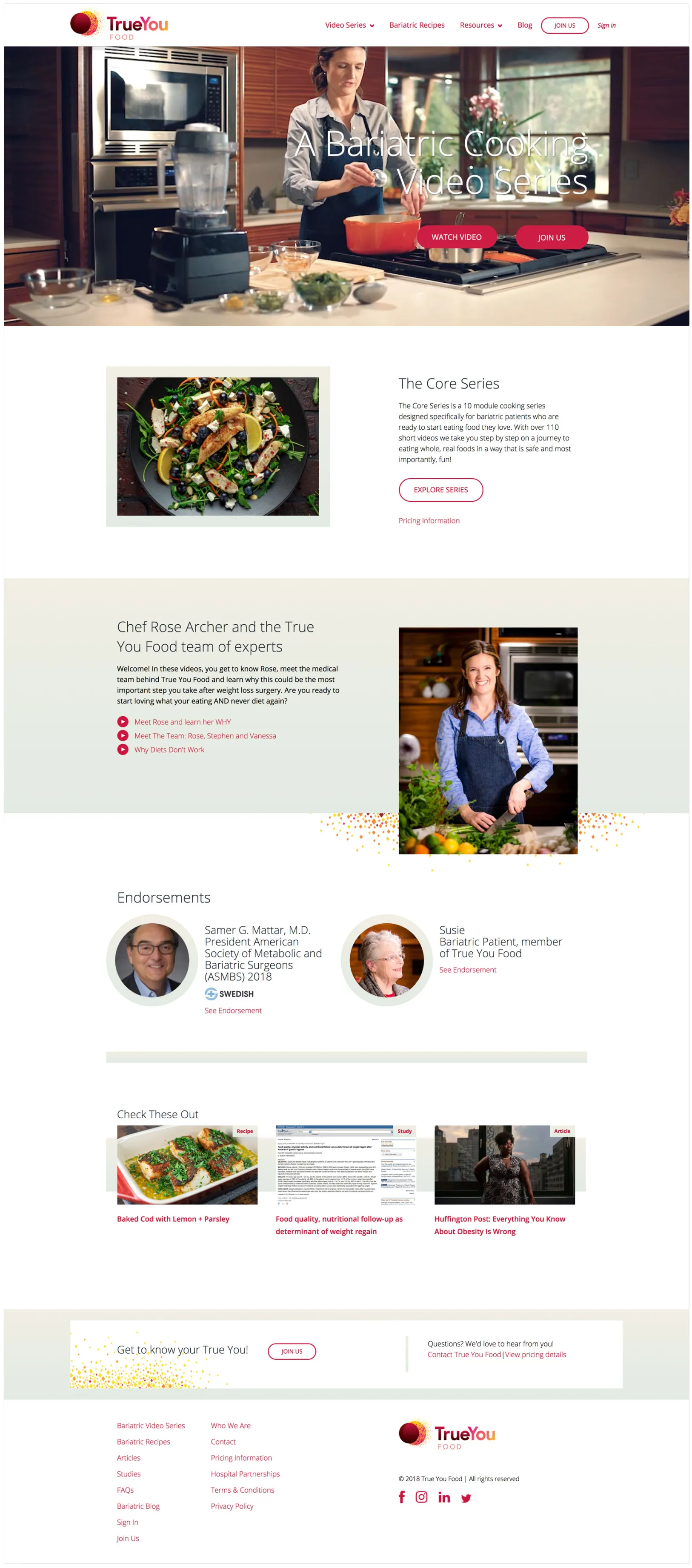
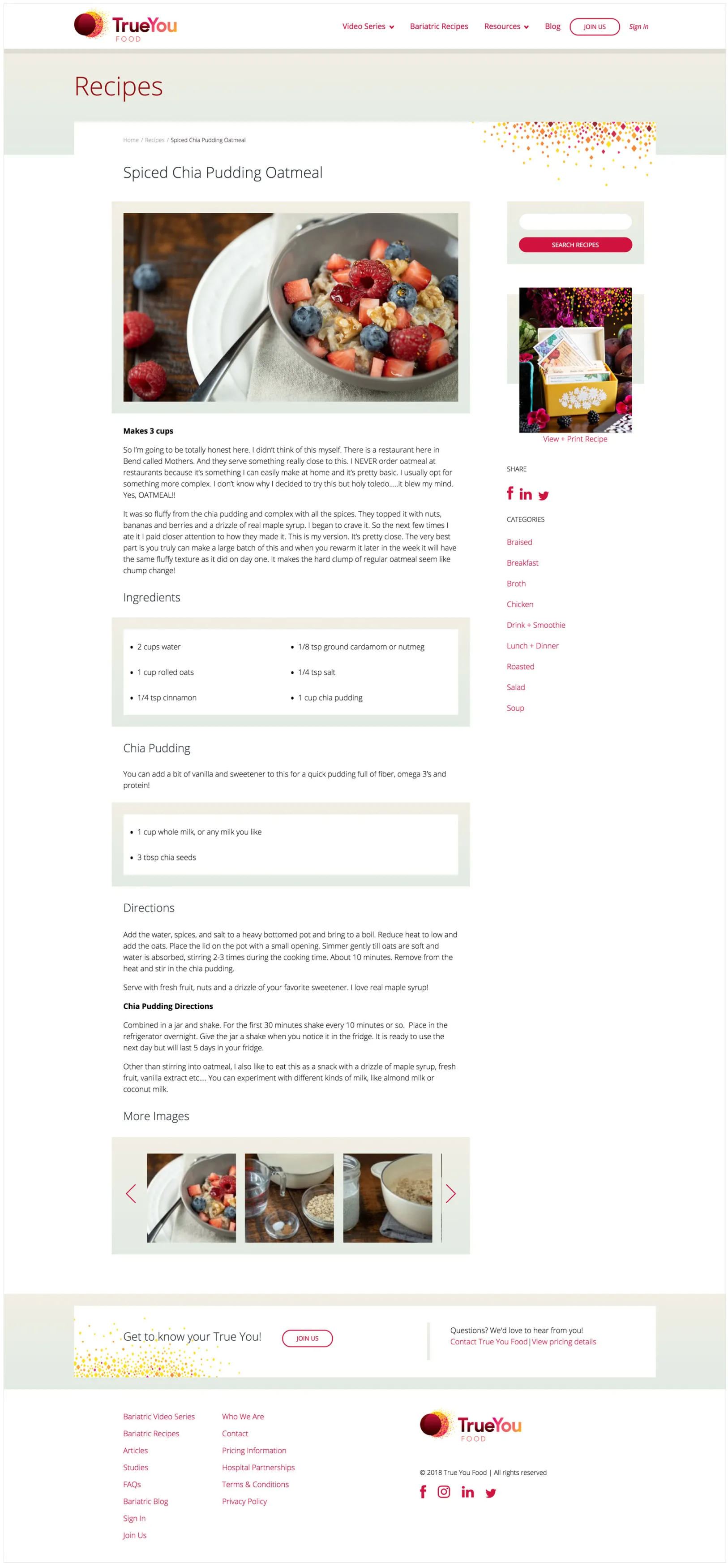
We worked extensively through the UX process to establish page outlines and content strategy, dynamic sitemaps and fully detailed wireframes. With a major emphasis on video content, our UI design work needed to support the primary video experience while staying out of the way. We ensured that the design was clean, fresh, bright and easy to read for older audiences, with airy layouts, highly organized text and wayfinding. Throughout the process, we placed emphasis on clarity and functional design, with just a dash of flavor.

Complexity meets elegance
Considering the technical challenges of the build and the client’s familiarity, we employed WordPress CMS in a wonderfully clean and intuitive way. Meeting the demands of layered permissions, gated content, customizable co-branded experiences and associated eCommerce is challenging. Doing it all while making it easy for a non-techy client to manage and update is even more challenging — and it’s what we do best.

Pursue Pictures
The artist is you
UX, UI design, art direction and custom WordPress development.