Wingo Case
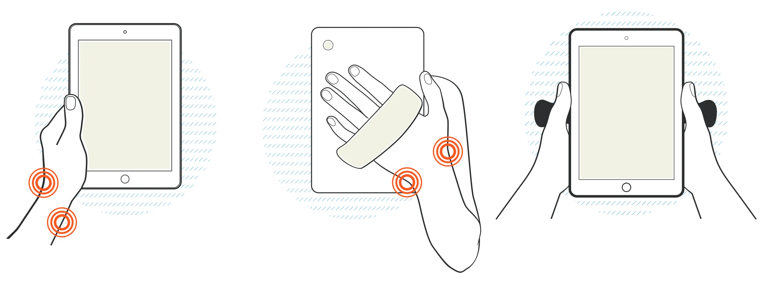
Designed to protect you, and your device
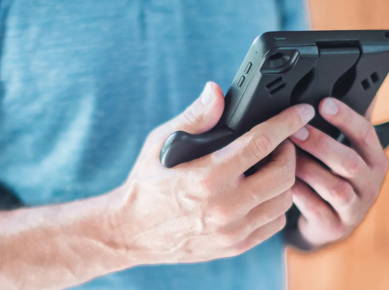
Project goals
When local start-up WingoCase shared their idea for an ergonomic iPad case with us, our task was to help them take it to market.
Our role
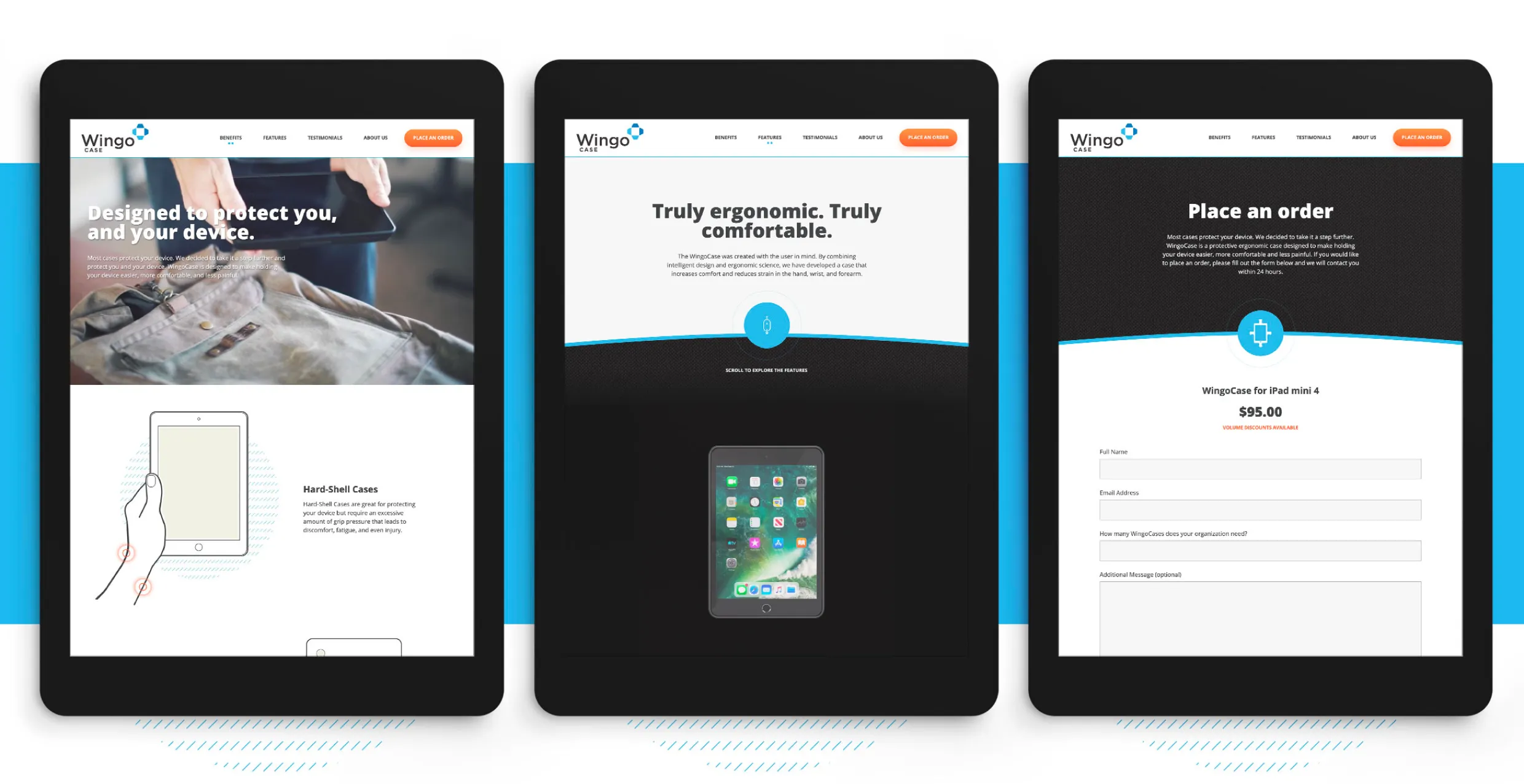
UX/UI design, front-end development, back-end Statamic development, overhauled brand and visual identity system, print and trade show booth design, photo/video shoot, 3D rendering, and custom illustrations.
Establishing a brand
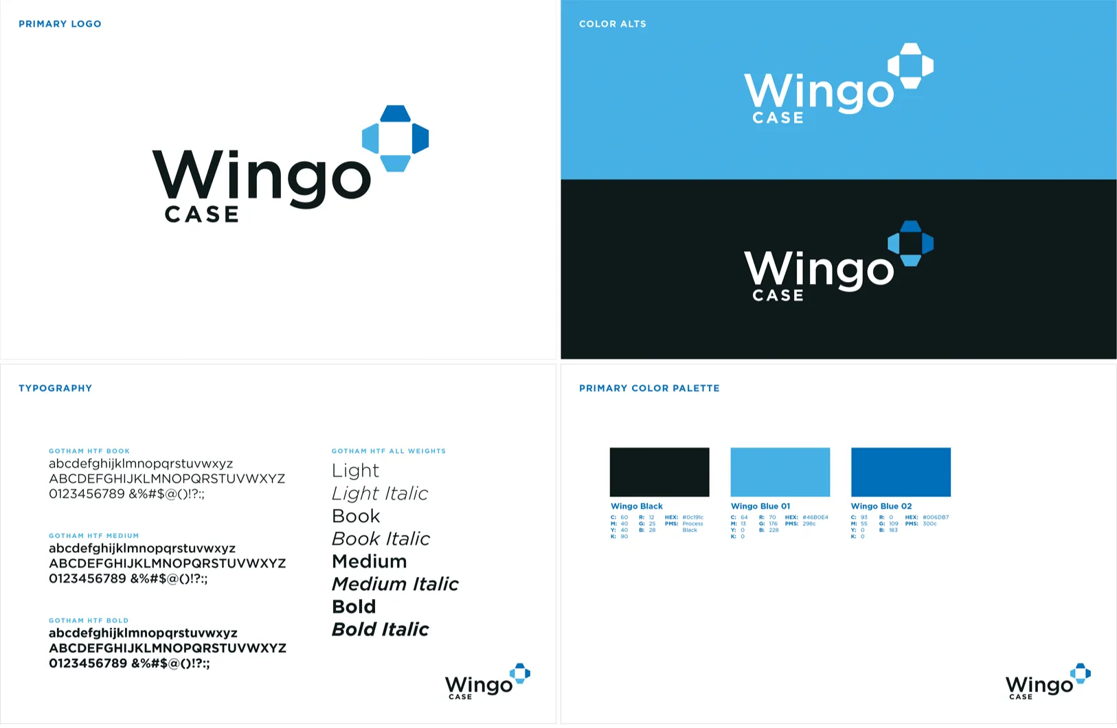
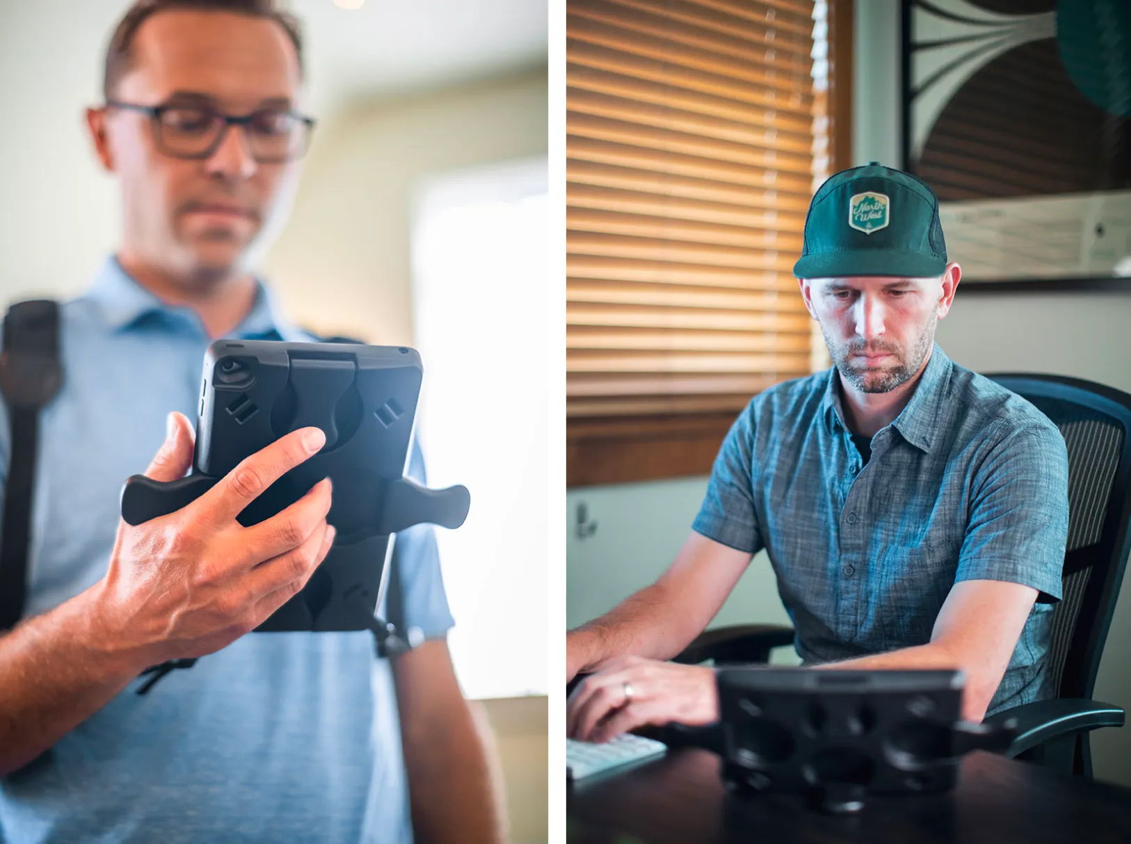
Our exploration started with logo and color concepts. Early drafts covered everything from softer, handwritten marks to refined typography. The final concept landed on a symbol that stylistically resembled the case when opened. In addition to the refreshed design system, we shot new photography and video so the case could be viewed in its many proper holding positions.
Animation as a strategy
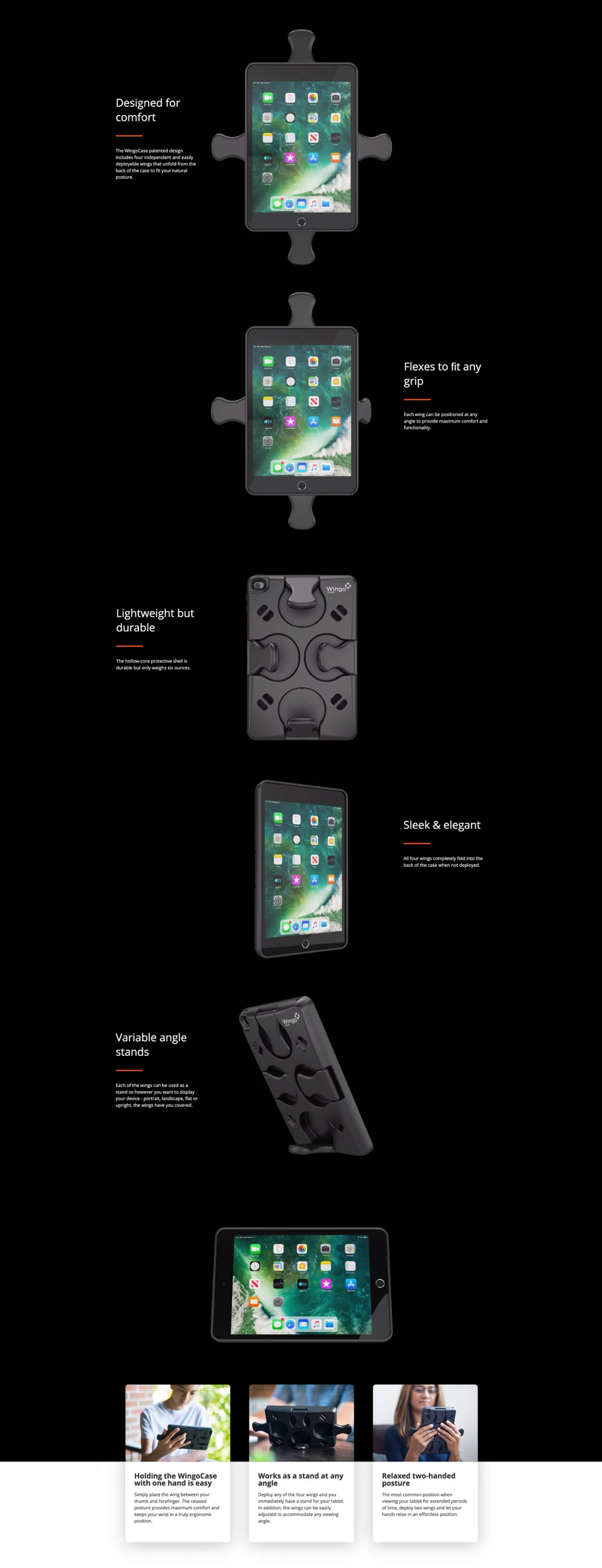
Once you hold a WingoCase, you quickly understand the benefits of using one. We wanted to develop a way for the customer to have that same experience online - and high-fidelity animation was the answer. We crafted scroll-based animations of a custom 3D rendering, allowing users to control the rotation of the device and read about its many features.
Ready for the roll out
Armed with a new website built on Statamic, and fresh print collateral WingoCase is ready for their first trade show. Turn Agency looks forward to the growth of WingoCase and their success at bringing forth the first truly ergonomic iPad case.
Tradeshift
Make shift happen
UX/UI design, iconography, illustrations, implementation of a custom brand font, photo direction, front-end development, and integrations with Marketo and Uberflip within the WordPress CMS.